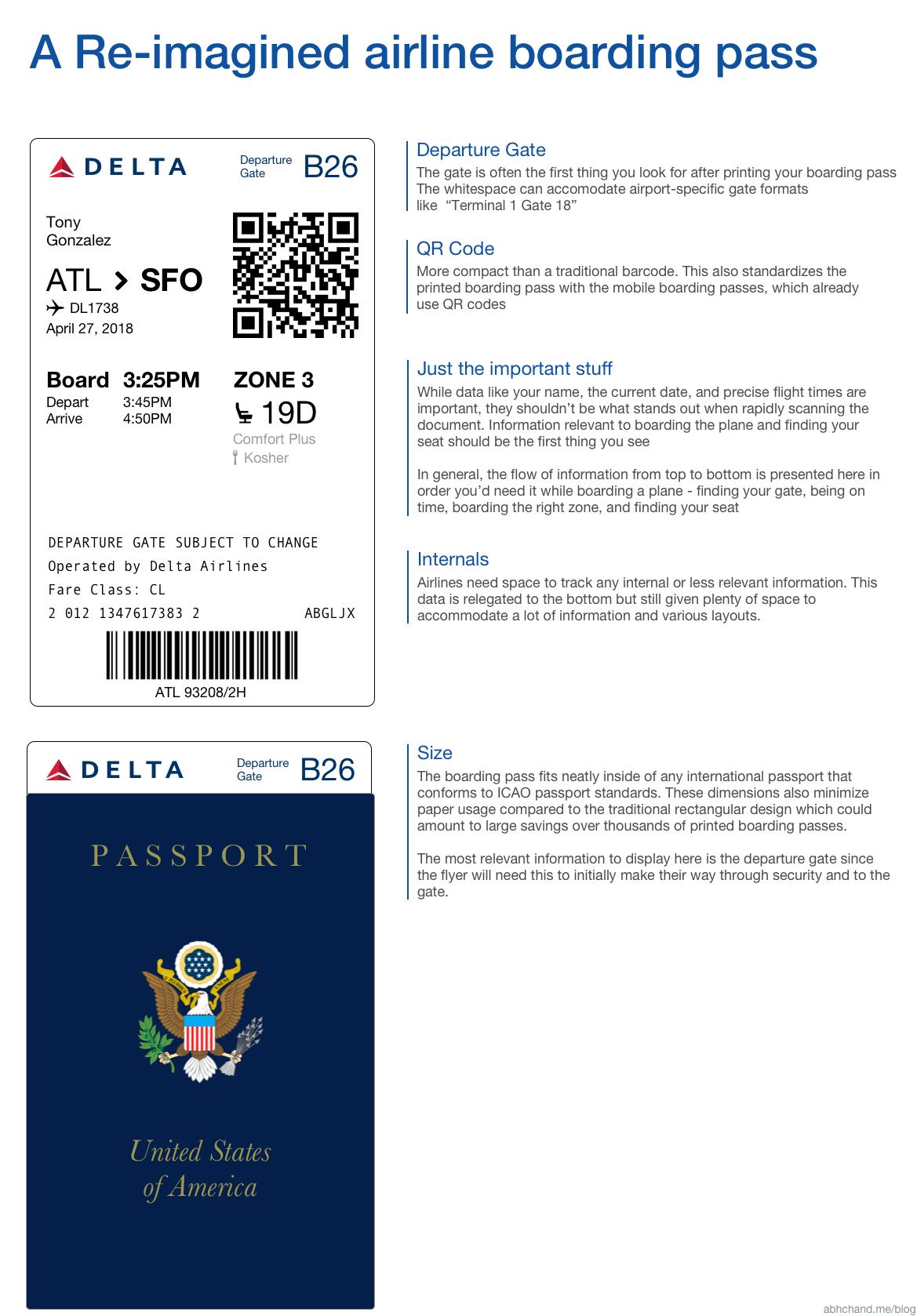
On a recent flight I almost made the mistake of going to the wrong gate because I misread the information on my boarding pass. While trying to quickly look for the terminal (C), I mistakenly read the value for my boarding group (B)
Anyone who has ever looked at their flight boarding pass to find a piece of information quickly has probably been frustrated by the cluttered state of information printed on their card.
Boarding passes need to convey a lot of information clearly and quickly. They represent a unique challenge to designers for this reason and are great exercises in designing for clear and quick communication of information.
I wondered if I could create a better one.
I’m far from the first person to do this. A quick search reveals numerous other blogs and designers that have taken a pass (heh) at this.
It still remains a bit of a pipe dream though. Airlines are hesitant to spend resources on projects such as this because of the costs of design, IT changes, product implementation, and rollout. End-to-end, a project like this could easily cost $1million+ which is a non-trivial amount for many cash strapped airlines.
But hey even with all that, it’s a fun project. There’s still tons of room for design input to make modern boarding passes friendlier for the flyer. ✈✈